• Portfolio
  • About
  • Contact
Lee Porter「desig ner 」
  • Portfolio
  • About
  • Contact

ATM15's "Live At The Jazzlab"


ATM15, a Melbourne-based jazz big band reached out to me to once again work on their new 3-part album: “Live At The Jazzlab”. I had lots of fun listening to the tracks and transforming their complex texture into visuals. Being a 3-part release, I decided to play with a theme that will tie across 3 different CDs while having their own individual character that represents each different volume.

Beside preparing the album design for print, the client has also requested some digital and social media exports for online usage.

 
ATM15_SS-22.png
ATM15_SS-21.png
ATM15_SS-9.png ATM15_SS-10.png ATM15_SS-11.1.png ATM15_SS-6.png ATM15_SS-7.png ATM15_SS-8.png
ATM15_SS-12.png ATM15_SS-13.png ATM15_SS-14.1.png ATM15_SS-24.png ATM15_SS-23.png
ATM15_SS-15.png ATM15_SS-16.png ATM15_SS-17.1.png ATM15_SS-18.png ATM15_SS-19.png ATM15_SS-20.png
 
categories: Print Design, Illustration
Wednesday 08.11.21
Posted by Lee Porter
 

Kolour In The Park


Kolour In The Park is an international music festival that is held each year in Bangkok, Thailand. The client was seeking a branding refresh of their festival for Kolour In The Park 2020.

Using KITP’s existing branding as a base – the new branding integrates a new colour palette paired with unique shapes for a fresh, trendy look.

Responsibilities:
• Design the new branding, from concepts to final artworks.
• Design promotional social and digital content in still and animated formats.
• Exporting social content to relevant social dimensions.
• Design additional promotional items like posters, social banners & printed festival collaterals.

 
KITP-SS-1.png
KITP-SS-2.1.gif
201029_KITP21_Square.png
KITP-SS-4.png
201030_KITP21_ArtistSquare.png
KITP-SS-3.gif
BrandIdentity_201030_KITP21_ElementsAll.png
201030_KITP21_FacebookEventCover3.png
201029_KITP21_Logo1.png
201030_KITP21_NoLineupSquare2.png
BrandIdentity_201029_KITP21_AnnounceSquare.png
201029_KITP21_Logo.png
KITP-SS-5.png
 
categories: Print Design, Social Media
Tuesday 08.03.21
Posted by Lee Porter
 

Caroline's Apple Cider Vinegar


Caroline’s (formerly known as Applelachia) is a healthy drink company based in Melbourne, Australia – specialising in apple cider vinegar-based products. For their new flavoured Apple Cider Vinegar drinks launch, the Client has reached out for some rebranding and label design work. They wanted something colourful, bold and playful that will appeal to a broad audience age range.

The chosen direction highlights the Apple Cider Vinegar ingredient by having an apple shape as the main design element 🍎 In the back, we have a hand-drawn infographic illustration featuring the drink-making process and the story behind Caroline’s. To complete, each of the drink flavours has its own colour palette: Yuzu Cola, Yuzu Ginger, Passionfruit, Blackcurrant and Raspberry Fingerlime.

 
Applelachia-SS-Mock-5.png
CAROLINES-SS-10.png
CAROLINES-SS-2.png
CAROLINES-SS-1.png
 

The Client wanted to explore a few different label concepts before arriving at the final design. The directions were more illustrative and ingredient-focused, while sampling different illustration styles. These earlier concepts follows the original information hierarchy with more text involved.

 
CAROLINES-SS-3.png
CAROLINES-SS-5.png
CAROLINES-SS-4.png
CAROLINES-SS-7.png
CAROLINES-SS-9.png
CAROLINES-SS-8.png
Applelachia-BottleMock_YuzuCola.png
Applelachia-LabelDesignMock-Blackcurrant2.png
Applelachia-LabelDesignMock-Passionfruit1.png
Applelachia-LabelDesignMock-RaspberryFingerlime2.png
Applelachia-LabelDesignMock-YuzuGinger.png
Applelachia-BottleMock_YuzuCola.png Applelachia-LabelDesignMock-Blackcurrant2.png Applelachia-LabelDesignMock-Passionfruit1.png Applelachia-LabelDesignMock-RaspberryFingerlime2.png Applelachia-LabelDesignMock-YuzuGinger.png
 
categories: Illustration, Print Design
Tuesday 08.03.21
Posted by Lee Porter
 

Phone Down


Phone Down is a Brisbane-based, Australian music festival created by Point Blank Group. The brief was to capture a fun cityscape with a minimal and colourful gradient look.

In addition to the printed poster, a series of still and animated digital assets were created for social media promotion and ticket sales.

Responsibilities:
• Design and illustrate the branding, from concepts to final artworks.
• Design all promotional social and digital content in still and animated formats.
• Exporting social content to relevant social dimensions.

 
PHONEDOWN_SS-1.png
PHONEDOWN_SS-3.png
PhoneDown21_Teaser_IGStill1.jpg
PhoneDown21_Teaser_IGStill1.png
PhoneDown21_ArtistTiles_NinaLasVegas.png
PHONEDOWN_SS-4.png
PHONEDOWN_SS-5.gif
PhoneDown21_TicketMaster_NewSpotlight1.png
PhoneDown21_TicketMaster_HiResArtwork.png
 
categories: Print Design, Illustration, Social Media
Thursday 07.08.21
Posted by Lee Porter
 

Beyond The Valley


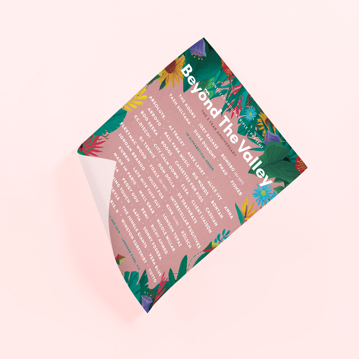
Beyond The Valley is a well-known Australian music festival that is held each year in Melbourne, Australia. The brief was to create a fun illustrated look inspired by florals and lush plants for their festival in 2018.

In addition, we also created a series of festival collaterals including but not limited to tickets, business card, information booklet and poster. Online & digital collaterals were also create for social media promotion.

Responsibilities:
• Design and illustrate the branding, from concepts to final artworks.
• Design all promotional social and digital content in still and animated formats.
• Exporting social content to relevant social dimensions.
• Design additional promotional items like posters, ad banners, printed festival collaterals.
• Assisting in designing, updating and maintaining their websites.

 
BTV-insta-mock-1-compressor.jpg
BTV-insta-mock-3-compressor.png
BTV_SS-3.png
btv-insta-2.png
dp-dark-2.png
btv-insta-3.png
btv-dp-dark2.png
BTV-insta-mock-5-compressor.png
BTV-insta-mock-4.png
BTV_SS-4-compressor.jpg
btv-mobile-1.png
btv-all-oversizedleaderboard-952x152-1.gif
btv-952x250.png
seventhst-btv-mrec.gif
btv-2018-siglight.gif
 
categories: Print Design, Illustration
Friday 08.21.20
Posted by Lee Porter
 

Wildlands


Wildlands were one of many music festivals that I’ve had the pleasure of working with over the years. In these projects, I was heavily involved in not just the festival branding but all the way up to social media design – as social content rollouts and printed collaterals were big chunks of the project.

Responsibilities:
• Design and illustrate the branding, from concepts to final artworks.
• Design all promotional social and digital content in still and animated formats.
• Exporting social content to relevant social dimensions.
• Design additional promotional items like posters, ad banners, printed festival collaterals.
• Assisting in designing, updating and maintaining their websites.

 
wildlands-insta.png
wildlands-mobile1.png
Wildlands_Square_ArtistTile_China.png
Wildlands_Square_ArtistTile_YBNCordae.png
Wildlands_Square_ArtistTile_ShockOne.png
Wildlands-ArtistTile.png
WILDLANDS_SS-1.png
Social-Media-SS-16.png
Wildlands_Spotify_Story.png
Wildlands-MediaAds-1080x250.gif
Wildlands_TicketRelease_1080x1350.gif
Wildlands-MediaAds-360x360.gif
Wildlands-MediaAds-300x250.gif
 
categories: Print Design, Illustration
Friday 08.14.20
Posted by Lee Porter
 

Au Dré


I was tasked with creating a new branding for Au Dre's new EP launch, as well as designing a launch poster for their gig with DX Heaven at The Gasometer.

As a reflection of their new album ( a mix of synth-pop, funk / soul + 90s sound ), the design is fun and youthful - compliments with pastel colour choices and hand-drawn typography.

If you wish to check out Au Dré - head to their Facebook or their SoundCloud page for more details.

 
categories: Print Design, Illustration
Saturday 04.04.20
Posted by Lee Porter
 

Battle Of The Band


The Push, a Victorian non-profit youth music organisation approached me to create an identity for Battle Of The Bands, a competition that gives new and upcoming band a chance to showcase their talents.

I went with a youthful design that is bold, fun and minimal - ensuring to create excitement amongst the audience. Also making sure that it is contemporary enough to not exclude other age groups from attending.

If you wish to check out The Push for upcoming events - head to their Facebook or their Instagram.

 
categories: Print Design
Friday 04.03.20
Posted by Lee Porter
 

Art Of Fresh


Art of Fresh is a four-day hip-hop camp developed for young people engaged with the Mirabel Foundation, which supports children living in kinship care. The Push approached me to design a promotional poster & CD that will illustrate the hip hop influence of the program.

If you wish to check out The Push for upcoming events - head to their Facebook or their Instagram.


Inspired by urban aesthetics such as fun, vibrant colours and shapes - I wanted to design something that will excite and capture the attention of interested participants.

Hand-drawn typography demonstrates a sense of child-like playfulness, which is the target audience of the project.


categories: Illustration, Print Design
Thursday 04.02.20
Posted by Lee Porter
 

Geddes Lane


Geddes Lane Ballroom, an upcoming Melbourne’s music venue contacted me for a poster design of their new regular music night. This was also later used for social media promotion.

They wanted an illustration that represents the physical building and venue space. I decided to run with colourful, fun colours and simple illustration style for a modern & friendly look.

Animation by @slowya.roll

 
GeddesLane-SS-1-compressor.png
GeddesLane-SS-4.png
GeddesLane-SS-3.png
GeddesLane-SS-2.png
GeddesLane-SS.gif
 
categories: Illustration, Print Design
Thursday 04.02.20
Posted by Lee Porter